Article
Hug Simulator Guide: Height Difference, Poses, and Shareable Scenes
Use Hug Simulator to build a quick, shareable hug scene with names, heights, colors, pose, and camera settings. This guide explains how to make the scene look natural and useful.
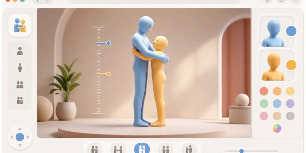
People usually search for a hug simulator with a very specific picture in mind: two people, a visible height difference, and a scene that is easy to send to someone else. The Hug Simulator works best when you treat it as a small scene builder rather than a measurement tool. You set the names, heights, colors, pose, and camera, then share the result as a lightweight link.
This guide walks through the choices that make the final scene feel clear, warm, and believable.
Start With the Height Difference
Height is the setting most people care about first. In the simulator, enter both heights before adjusting colors or pose. A small difference can still read clearly when the camera is close; a larger difference usually looks better from a slightly wider view so both characters stay visible.
For a natural result:
- Use real approximate heights if you want the scene to feel personal.
- Use rounded heights if the scene is just for fun.
- Swap the two people if the hug direction feels wrong after previewing it.
- Recheck the camera after changing height, because a good view for one pair may crop another pair awkwardly.
The tool is designed for visual comparison and shareable scenes, not medical, relationship, or body-measurement advice. If the height difference looks slightly stylized, that is normal for a browser scene generator.
Choose the Pose Before Fine-Tuning Colors
The front-hug and back-hug options change the emotional read of the scene. A front hug feels direct and classic. A back hug feels more playful or cinematic. Pick the pose first, then choose character colors that make the two figures easy to distinguish.
If both characters use similar colors, the pose can become harder to read in a screenshot. A good simple setup is one warm color and one cool color, or one bright color and one muted color. The goal is not perfect realism; the goal is a scene that reads instantly when someone opens the link.
Use Names Only When They Help
Names make the scene feel personal, especially when you are sending it to a friend or partner. For public sharing, nicknames or initials are usually safer. The shared link can preserve the scene settings, so avoid adding anything you would not want someone else to see.
For a casual post, use short labels. For a private message, real names can make the scene feel warmer. If the names are long, check the final view on mobile so the interface still feels clean.
Make the Camera Do the Work
The camera angle matters more than most people expect. After setting height and pose, switch views and look for three things:
- Both heads and feet should be visible unless you intentionally want a close-up.
- The hug should be readable without needing an explanation.
- The taller character should not hide the shorter character.
If the scene feels flat, try a slightly angled view. If the height difference is the main point, choose a view that keeps both bodies upright and easy to compare.
Share the Link, Then Reopen It Once
Before sending the scene, use the share or copy option and reopen the link in a new tab. This quick check confirms that names, heights, colors, pose, and viewpoint survived correctly. It also catches the most common mistake: sharing before the final camera adjustment.
If you want something more meme-like after making a hug scene, try the Floor Slam Simulator or Bed Slam Simulator. If you want to browse the full set of tools, the FreeSimulators guide groups everything by use case.
Best Uses for Hug Simulator
The Hug Simulator is especially good for:
- Sending a quick comfort scene to someone.
- Showing a funny or cute height difference.
- Making a lightweight character scene without downloading an app.
- Creating a shareable visual for a chat, profile, or group joke.
Keep it simple: two readable characters, one clear pose, and a camera angle that makes the height difference obvious. That usually produces a better result than over-tuning every setting.