Article
Nuclear Bomb Radius Simulator Guide: How to Read Blast Maps Responsibly
Learn what a nuclear bomb radius simulator can and cannot show, how to interpret map rings, and why blast-radius maps should be treated as educational approximations.
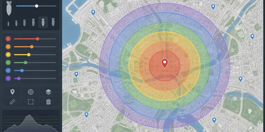
A nuclear bomb radius simulator can be compelling because it turns an abstract yield number into a map. That visual power is exactly why it needs context. The Nuclear Bomb Simulator and Nuke Simulator on FreeSimulators are educational map tools, not emergency planners, casualty predictors, or tactical systems.
Use them to understand scale, compare public yield estimates, and learn why distance matters. Do not use them as a source of real-world safety instructions.
What the Radius Rings Mean
Blast-radius maps usually show several zones around a selected point. The innermost ring represents the most severe effect, while outer rings represent progressively lighter modeled effects. The exact labels depend on the simulator, but the purpose is the same: to help you compare relative scale.
The most important idea is not a single number. It is the pattern: when yield increases, the affected radius grows, but not in a simple one-to-one way. A much larger yield does not mean every ring becomes larger by the same multiplier.
Why These Maps Are Approximations
Real nuclear effects depend on many variables that a simple browser tool cannot fully model:
- Burst altitude
- Weather and visibility
- Terrain and building density
- Shielding and indoor/outdoor exposure
- Weapon design
- Local geography
- Emergency response conditions
That means two places at the same distance from the center could have very different real-world outcomes. A radius map is a learning model, not a prediction engine.
Compare Yields Carefully
The simulator may include historically known or publicly discussed yield estimates. Comparing them can help you understand scale, but avoid treating the comparison like a ranking game. The point is not spectacle; it is comprehension.
A better way to compare:
- Place the marker on a familiar city center.
- Start with a lower public-yield example.
- Increase to a larger example.
- Watch how each ring changes.
- Ask what the map does not show.
That last step matters. The map shows approximate distance. It does not show panic, infrastructure failure, medical capacity, long-term displacement, or the full human consequences.
Use Familiar Maps for Scale, Not Shock
People often learn distance better on a familiar map. If you know how long it takes to cross a neighborhood, a radius ring becomes easier to understand. This can make the simulator useful for education, journalism context, or history discussion.
Use the map to ask scale questions:
- How large is this ring compared with a neighborhood?
- Which familiar landmarks fall inside or outside it?
- How does changing yield alter the map?
- Which factors are missing from this simplified view?
Avoid using the map to make confident claims about what would happen to specific people or buildings. The tool is not detailed enough for that.
Nuclear Simulator vs Nuke Simulator
Use Nuclear Bomb Simulator when you want a straightforward educational blast-radius comparison. Use Nuke Simulator when you prefer a map-first workflow and want to explore multiple public-yield examples quickly.
Both are meant for understanding scale. Neither should be used for emergency decisions. If you are dealing with a real emergency, follow official local guidance and emergency services.
Responsible Takeaway
A nuclear bomb radius simulator is useful when it makes an unthinkably large event easier to reason about with humility. The right response to the map is not certainty; it is perspective.
Treat the rings as approximate educational overlays, compare yields carefully, and remember that the most important realities are the ones a simple map cannot fully show.